

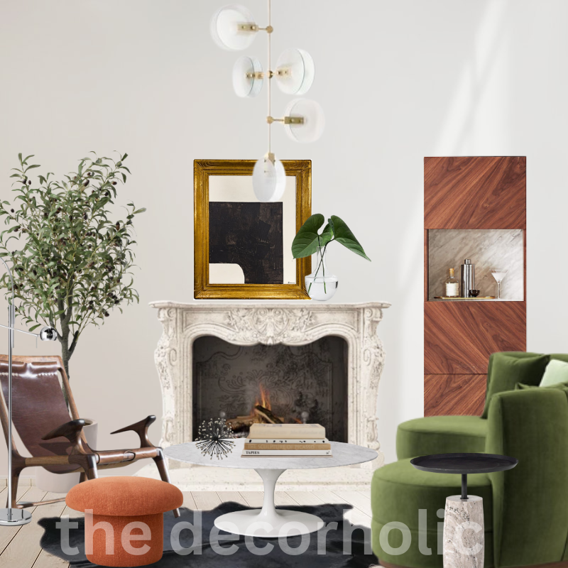
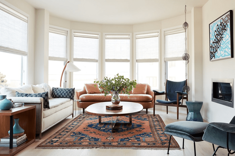
Here are seven ways to create a color palette for your home. When it comes to designing your living space, one of the most crucial aspects to consider is the color palette. The colors you select can profoundly influence the overall look and feel of your home.
A beautiful color palette can create a harmonious and inviting atmosphere that reflects your personal style. In this article, we will explore the best ways to create stunning color palettes for your home.
Whether you prefer a vibrant and energetic ambiance or a calm and serene retreat, these seven tips to create a color palette for your home will help you transform your space into a visually appealing haven.
The Importance of Creating a Color Palette When Decorating
Creating a color palette is essential when decorating because it sets the foundation for the overall look and feel of a space. A well-thought-out color palette brings cohesion, harmony, and visual interest to a room, transforming it from a collection of disparate elements into a unified and inviting environment. Here are a few reasons why creating a color palette is important in the process of decorating:
1. Establishes a Visual Theme:
A color palette serves as a visual theme that ties together all the elements in a room. It provides a sense of coherence and allows for a more seamless flow between different design elements, such as furniture, accessories, walls, and flooring. By choosing colors that complement and enhance each other, you create a unified and well-designed space.
2. Sets the Mood and Atmosphere:
Colors have the power to evoke emotions and influence our perception of a space. By carefully selecting colors for your palette, you can create a desired mood or atmosphere. Whether you want a calm and tranquil ambiance in a bedroom or a vibrant and energetic vibe in a living room, the right colors can help achieve these effects. Colors can evoke feelings of serenity, warmth, excitement, or relaxation, and by harnessing their psychological impact, you can shape the desired experience in a room.
3. Enhances Visual Interest:
A thoughtfully curated color palette adds visual interest and depth to a space. It creates layers and dimensions, making the room visually engaging and captivating. By incorporating different shades, tones, and complementary colors, you can introduce contrast and balance, highlighting focal points and creating a visually dynamic environment.
Also: Feng Shui Principles for Harmonious Home Decor
4. Supports the Overall Design Concept:
A color palette helps to support and reinforce the overall design concept or style you wish to achieve. Whether you’re aiming for a modern, minimalist look or a cozy, rustic feel, colors play a crucial role in conveying that style. The right color palette can enhance the architectural features, highlight specific design elements, and bring out the essence of the chosen design theme.
5. Personalizes the Space:
Creating a color palette allows you to infuse your personal taste and style into the room. It reflects your personality, preferences, and the atmosphere you want to create. Your color choices can be a form of self-expression and can transform a house into a home that feels uniquely yours.
Understanding the Psychology of Color
Colors have the power to evoke emotions and influence our mood and perception. Understanding the psychology of color can help you make informed choices when selecting colors for your home. Here are some common associations with colors:
- Red: Symbolizes passion, energy, and excitement. It can stimulate appetite, making it a great choice for dining areas or kitchens.
- Blue: Evokes calmness, tranquility, and serenity. It is often used in bedrooms or spaces where relaxation is desired.
- Yellow: Represents happiness, optimism, and creativity. It can bring a cheerful and energetic atmosphere to spaces like living rooms or home offices.
- Green: Symbolizes nature, growth, and freshness. It promotes a sense of harmony and balance, making it suitable for any room in the house.
- Purple: Associated with luxury, creativity, and spirituality. It can add a touch of elegance and sophistication to spaces like bedrooms or study areas.
- Orange: Radiates warmth, enthusiasm, and vibrancy. It can create an inviting and energetic atmosphere in areas such as entryways or living rooms.
Keep in mind that individual experiences and cultural backgrounds can also influence how colors are perceived. It’s essential to consider personal preferences and the intended purpose of each space when selecting colors.
What is Color Theory?
Before diving into the best ways to create beautiful color palettes, it’s essential to understand the basics of color theory. Color theory is the study of how colors interact with each other and the emotional responses they evoke. By understanding the principles of color theory, you can make informed decisions when selecting colors for your home.
Also: How To Choose The Perfect Interior Color Scheme For Your Home
The Color Wheel: A Tool for Harmony
The color wheel is a fundamental tool used in color theory. It consists of primary, secondary, and tertiary colors arranged in a circular format. The primary colors are red, blue, and yellow, while secondary colors are created by mixing primary colors.
Tertiary colors are formed by combining primary and secondary colors. By using the color wheel, you can create harmonious color schemes. There are several types of color schemes to choose from, such as complementary, analogous, and monochromatic.
Get Your Color Palette From The Color Wheel
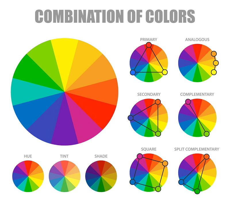
The color wheel is an invaluable tool when it comes to creating beautiful color palettes for your home. It provides a visual representation of how colors relate to each other and can help you choose harmonious combinations. Let’s explore some popular color schemes derived from the color wheel:
Analogous Color Palettes
Analogous color schemes involve selecting colors that are adjacent to each other on the color wheel. For example, if you choose blue as your base color, you can complement it with shades of green and purple. This color scheme creates a sense of harmony and works well in rooms where you want a calm and relaxing atmosphere, such as bedrooms or living rooms.
Complementary Color Palettes
Complementary colors are pairs of colors that are opposite each other on the color wheel. Combining these colors creates a high-contrast and vibrant effect. For instance, yellow and purple, or orange and blue, are complementary pairs. When using complementary color palettes, it’s best to use one color as the dominant hue and the other as an accent to create a visually striking space.
Triad Color Palettes
Triad color schemes consist of three colors that are evenly spaced around the color wheel, forming an equilateral triangle. For example, you can combine red, yellow, and blue for a triad color palette. This scheme provides a balanced and dynamic look, perfect for rooms where you want a cheerful and energetic vibe, like children’s playrooms or home offices.
Also: How to Choose the Perfect Fabrics to Decorate Your Home
Split Complementary Color Palettes
Split complementary color schemes offer a twist on the traditional complementary colors. Instead of using the direct opposite color, you select the two colors adjacent to the complementary color. For instance, if your base color is blue, the split complementary colors would be yellow-orange and red-orange. This scheme maintains the contrast of complementary colors while offering a bit more versatility and subtlety.
Tetradic Color Palettes
Tetradic color palettes involve selecting four colors that form a rectangle or square on the color wheel. This scheme allows for a wide range of color combinations and gives you the opportunity to create bold and visually striking spaces.
To achieve a tetradic color palette, choose two pairs of complementary colors. For example, you can pair blue with orange and yellow with purple. This scheme provides ample opportunity for creativity and can be used to create vibrant and eclectic interiors.
By utilizing these color schemes derived from the color wheel, you can confidently create beautiful and harmonious color palettes for every room in your home.
Remember to consider the mood you want to achieve, the size and lighting of the space, and your personal preferences when selecting colors. Let your creativity shine as you play with different combinations and create a truly unique and visually appealing home.
Best Ways to Create Beautiful Color Palette for Your Home
1. Gather Inspiration from Nature
Nature is an excellent source of inspiration when it comes to color palettes. Take a walk in a park or garden and observe the colors around you. Pay attention to the vibrant hues of flowers, the soothing tones of leaves, and the calming shades of the sky. Nature provides an endless array of color combinations that can be translated into your home’s color palette.
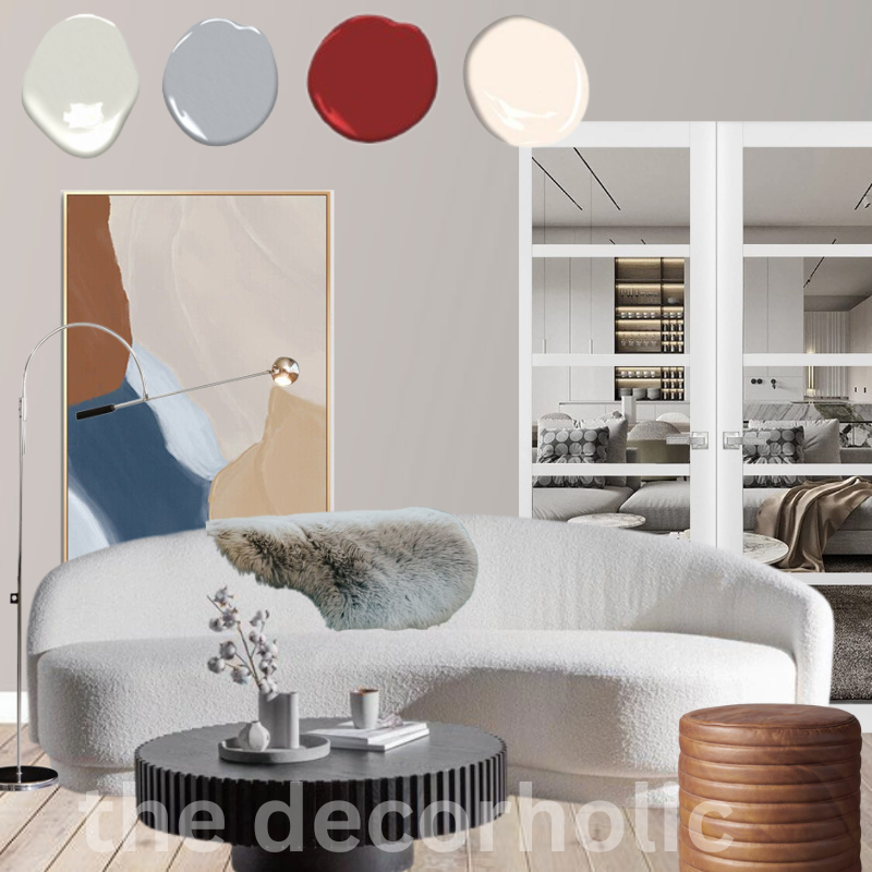
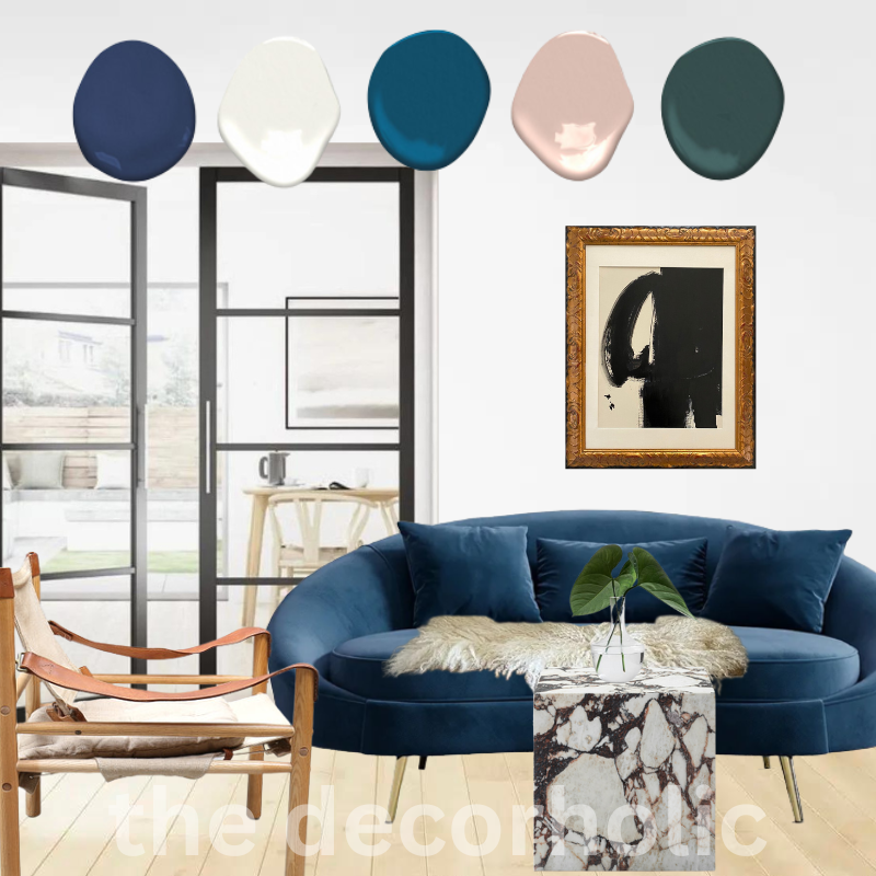
2. Gather Inspiration from Art Piece
Gathering inspiration from art pieces is a fantastic way to inform and enrich your color palette when decorating. Art has long been a source of inspiration for design, as it showcases the creative use of color, composition, and visual storytelling. By studying and analyzing artwork, you can gain valuable insights into color combinations, harmonies, and the interplay of different shades and tones.
Whether it’s a vibrant painting, a captivating photograph, or a beautifully crafted sculpture, art offers a wealth of inspiration for color exploration. Pay attention to the color choices made by artists and how they contribute to the overall mood and message of the artwork. Observe the way colors are layered, blended, and juxtaposed, and consider how you can apply similar techniques to your own color palette.
Also: Designers Reveal How Many Colors You Should Have In Your Home
3. Consider the Mood You Want to Create
Different colors evoke different moods and emotions. Before selecting colors for your home, consider the atmosphere you want to create in each room. For example, warm colors like red, orange, and yellow can create a cozy and energetic ambiance, while cool colors like blue and green promote a sense of calmness and relaxation.
4. Start with a Neutral Base
When creating a color palette for your home, it’s often best to start with a neutral base. Neutral colors such as white, beige, and gray provide a versatile backdrop that can be easily paired with other colors. They also create a sense of balance and allow other elements in the room, such as furniture and accessories, to stand out.
5. Use the 60-30-10 Rule
The 60-30-10 rule is a popular guideline used by interior designers to create a well-balanced color palette. According to this rule, 60% of the room should be dominated by a primary color, 30% by a secondary color, and 10% by an accent color. This rule helps maintain visual harmony and prevents the space from feeling overwhelming or disjointed.
6. Experiment with Different Shades and Tones
Don’t be afraid to experiment with different shades and tones of your chosen colors. By incorporating various shades, you can add depth and dimension to your color palette. Consider using lighter shades for larger areas and darker tones for accents and focal points.
Also: No-Fail Formula to Create a Gallery Wall
7. Test Colors in Different Lighting Conditions
Lighting plays a crucial role in how colors appear in a room. Before finalizing your color palette, test the colors under different lighting conditions. Natural daylight, warm artificial light, and cool fluorescent light can all affect how colors are perceived. By examining the colors in various lighting situations, you can ensure that they look their best in any setting.
How Many Colors to Choose for Your Color Palette?
Determining the number of colors to include in your color scheme depends on various factors, such as the size of the space, the desired style, and your personal taste. Generally, it’s best to keep the color palette simple and not overwhelm the room with too many colors.
For a cohesive and harmonious look, aim for a palette of 3-5 colors. This includes the dominant color, secondary color(s), and accent color. By limiting the number of colors, you ensure that the space feels visually balanced and unified.
Also: Best Fall Decorating Ideas: Crafting Your Autumn Wonderland
Remember that neutrals, such as whites, beiges, and grays, can also be considered colors within your palette. They provide a versatile backdrop and can help balance the overall composition. Including neutrals allows you to introduce additional colors through furniture, artwork, or accessories without overwhelming the space.
How to Create a Balanced Color Palette
Creating a balanced color scheme is essential for achieving a visually pleasing result. One effective way to create balance is by using the 60-30-10 rule mentioned earlier.
Distribute the colors in your palette as follows: 60% for the dominant color, 30% for the secondary color, and 10% for the accent color. This rule ensures that one color doesn’t overpower the others, allowing for a harmonious composition.
Also: The Ultimate Guide to Throw Pillow Styling
Another aspect to consider is the saturation and intensity of colors. Balancing bold and vibrant colors with softer and more neutral tones helps create a sense of equilibrium. Additionally, pay attention to the distribution of colors throughout the space to maintain a balanced visual flow.
You can achieve this by repeating colors and using them strategically in different areas, such as walls, furniture, accessories, and textiles.
Best Easiest Way to Combine Colors
Combining colors may seem like a daunting task, but it doesn’t have to be. One of the best and easiest ways to combine colors is by using a monochromatic color scheme. A monochromatic color scheme involves using different shades and tones of a single color.
Also: 7 Essentials for a Stylish and Functional Entryway
This approach creates a cohesive and harmonious look while simplifying the color selection process. By playing with light and dark variations of the same color, you can add depth and visual interest to your space without worrying about color clashes.
How to Add More Colors to Your Color Palette
If you feel that your color scheme needs a bit more variety, there are several ways to introduce additional colors without disrupting the overall harmony. Here are a few suggestions:
- Use a Color Wheel: Refer back to the color wheel and select colors that are analogous or complementary to your existing palette. These colors will naturally harmonize with the ones you have already chosen.
- Introduce Accents: Add pops of color as accents throughout the space. This can be done through throw pillows, rugs, curtains, artwork, or decorative accessories. Choose colors that complement your existing palette to maintain cohesiveness.
- Consider Patterns: Incorporate patterns that include different colors within your scheme. Patterns can bring visual interest and introduce additional shades without overpowering the space.
- Nature-Inspired Colors: Look to nature for inspiration. Take cues from landscapes, plants, or flowers and incorporate their colors into your palette. Nature provides a harmonious color palette that is pleasing to the eye.
Remember, balance is key when adding more colors. Be mindful of how the new colors interact with the existing ones, and ensure they contribute to the overall harmony and aesthetic of the space.
With these insights into combining colors, creating a balanced color scheme, understanding the psychology of color, determining the number of colors to choose, and adding more colors to your palette, you are well-equipped to embark on your journey of designing beautiful color palettes for your home.
Let your creativity soar as you experiment with different combinations, and remember to trust your instincts and have fun along the way!
Most Popular Post:
How to Choose The Right TV Size to Decorate Your Living Room
The ultimate Smart Home Design Guide: Automate your life
Tips for Home Decorating on a Budget: Where to Splurge and Save
10 Best Couch Colors That Make a Room Look Bigger
Conclusion
Ways to create a beautiful color palette for your home is an exciting and creative process. By understanding the principles of color theory, gathering inspiration from nature, and considering the mood you want to create, you can design a space that truly reflects your personal style.
Remember to experiment with different shades, test colors in various lighting conditions, and follow the 60-30-10 rule to achieve a well-balanced color palette. With these best ways to create beautiful color palettes for your home, you can transform your living space into a stunning haven of style and harmony.
Ways To Create A Color Palette-(FAQs)
FAQ 1: How do I choose colors that complement each other?
Choosing colors that complement each other can be achieved by using the color wheel. Complementary colors are opposite each other on the color wheel. For example, blue and orange, or red and green, are complementary pairs. By selecting colors from opposite sides of the wheel, you can create a vibrant and visually appealing color palette.
FAQ 2: What are some popular color schemes for home interiors?
There are several popular color schemes for home interiors, including:
- Complementary Color Scheme: Using colors that are opposite each other on the color wheel.
- Analogous Color Scheme: Selecting colors that are adjacent to each other on the color wheel.
- Monochromatic Color Scheme: Using different shades and tones of a single color.
- Neutral Color Scheme: Incorporating various neutral colors like white, beige, and gray.
FAQ 3: How can I make a small room appear larger using color?
To make a small room appear larger, opt for lighter colors on the walls and ceiling. Lighter shades reflect more light, creating an illusion of space. Avoid using dark colors, as they tend to make a room feel more confined. Additionally, incorporating mirrors and strategic lighting can further enhance the perception of space.
FAQ 4: Can I use bold and vibrant colors in my color palette?
Yes, you can certainly use bold and vibrant colors in your color palette. However, it’s important to use them in moderation. Bold colors work best as accents or focal points to create visual interest. Pair them with neutral or softer tones to maintain balance and prevent overwhelming the space.
FAQ 5: How can I create a cohesive color palette for an open floor plan?
Creating a cohesive color palette for an open floor plan can be challenging. It’s crucial to select colors that flow harmoniously from one space to another. Consider using a common neutral base throughout the open area and then introduce pops of color that complement each other. This will create a sense of continuity while allowing each space to have its unique character.
FAQ 6: Should I consider the color trends when creating a color palette?
While color trends can be inspiring, it’s essential to prioritize your personal style and preferences when creating a color palette. Trends come and go, but a well-curated color palette should reflect your long-term vision for your home. Choose colors that resonate with you and create a space that you will love for years to come.
CATCH THE LATEST IN HOME DECOR TRENDS:

Steal These 15 Expert-Approved Decorating Secrets

How To Accessories Your Living Room

Small Space? 10 Ways To Make A Room Appear Bigger

Make Your space Look Expensive
GET CAUGHT UP ON ALL THE INSPIRING DECOR TIPS:

18 Fresh Decorating Ideas To Update Your Fireplace

How To Create An Art Gallery Wall
